PAULA DESCHAMPS • UX DESIGNER
  • Portfolio
  • About
  • ARTICLES
  • Contact

Food Delivery App


​Helping an app understand its users and map improvements to captivate them
​
My contributions: user interviews, interview script, benchmarking, cloze test, usability testing, A/B testing, guerrilla test, affinity diagram, micro-optimizations, flow study and flow optimization 
Role: UX Researcher
Duration:  12 weeks (Nov. 2021 – Jan. 2022)

THE PROJECT

Food delivery apps have been rising and thriving in recent years, especially after the pandemic hit. However, competition is tough and you need to understand your user in order to make sure you are delivering what they want (literally, and also regarding the app experience).
 
I worked together with UX researchers and product designers in this 12 week project to understand what were the communication issues and usability issues within app that were making it hard for users to complete the main task within the app: order the food they wanted with ease.


This project was developed at Sensorama Design. To comply with my non-disclosure agreement with Sensorama Design and this client, I have omitted and obfuscated confidential information in this case study. 

CONTEXT

The client we worked with is a multinational company and Brazil is one of the countries where they run their operation. They hired us because they wanted us to Investigate how to improve their digital experience through a process guided by experience, communication and conversion.

​This material would be used for them and to report back to their HQ where major decisions regarding the app structure are made.

THE CHALLENGE

FINDING WHAT WAS NOT WORKING WITH THE UX AND UI OF THIS APP AND
​PROVIDE INSIGHTS AND SOLUTIONS FOR THE PROBLEMS

Users of this food delivery app had consider the app as one where it would not help them to make good choices, rather than being a quick and easy way to order food. This is a problem because the difficulty to use the app would get the users frustrated, leading to lower conversion rates. This is also a problem for the company, as they are trying to increase their market in Brazil and the retention being low means the company is losing users to competitors.

​Our high level goals were to:
  • Providing insights on how the communication within the app could be better
  • Inspecting and evaluating the usability of the app
  • Acquiring enough evidences of usability issues for the BR team to report back to the HQ

UNDERSTANDING THE BUSINESS

At the outset of the project we needed to gather information relevant to the project brief so we ran a business workshop. Topics discussed:
  • App brand strategy;
  • App Marketing environment;
  • Team perspectives on user pain
  • Uncertainties about this app users
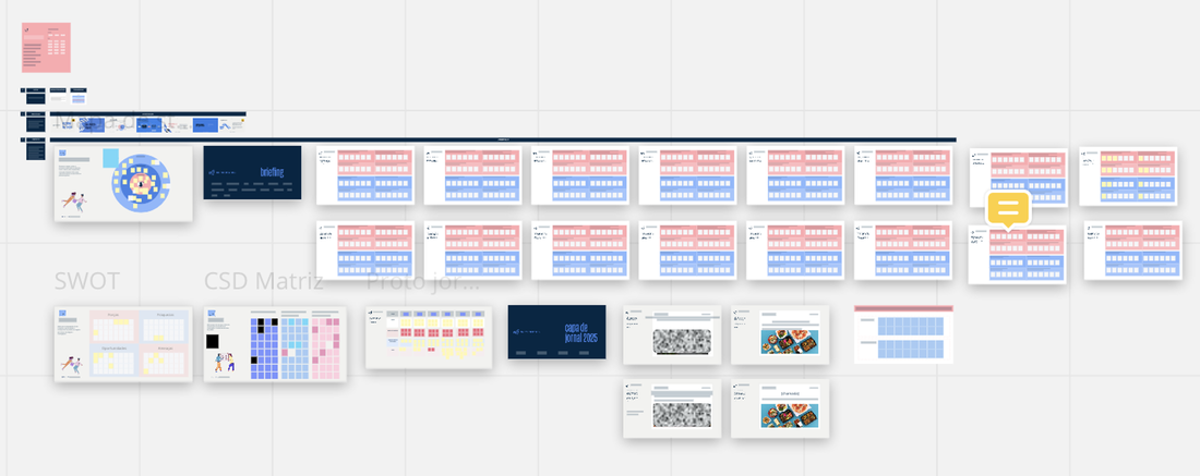
Miro of our business workshop

​ORGANIZING THE RESEARCH

The information provided in this workshop was analyzed and consolidated into research questions to guide the research and data analysis. Their main goal was to understand:
  1. How do users decide what to order in delivery apps?
  2. How do users navigate food delivery apps?
  3. What are the key attributes of food apps that are important to our client?

DISCOVER AND DEFINE

The design discover and definition (as per the double diamond) was structured in two parts:
·      Qualitative: interviews + usability test, benchmarking, heuristic Analysis, guerrilla usability testing
·      Quantitative research: survey, cloze test
Picture
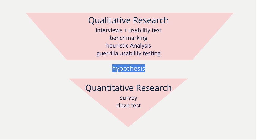
Structure of our research following the double diamond first two parts
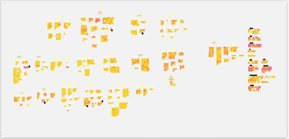
Deeply understanding the users

We interviewed 25 users from the three target states in Brazil. Our goal was to investigate how people order food through apps. We mapped their answers, then gather the information using an affinity diagram, were we tagged groups of answers and had sub tags within the groups. This way information was easier to find and we started to discover patterns.
 
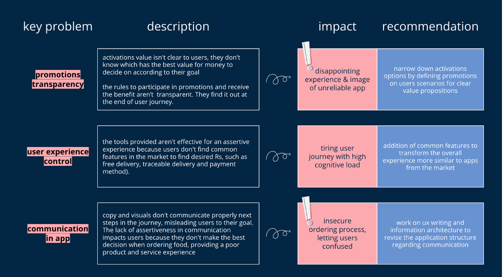
We compared the information from the interviews with the benchmarking when it made sense to understand the current user experience in comparison with those of direct or indirect competitors. We also did correlations with the Heuristics analyses we ran, where we identified 70 usability issues within the app.
​Results divided into groups - first stage:
Results divided into groups: first stage
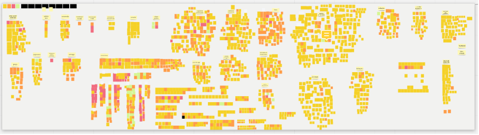
​Results with sub tags within groups and indications of important information:
Picture

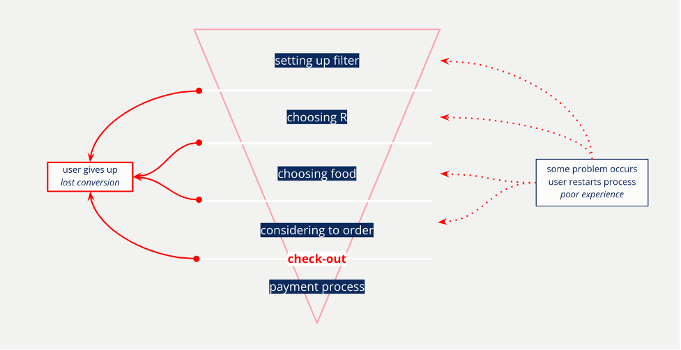
​We mapped findings related to users habits, desires, wishes and pain points when searching for food. We co-related those with the product experience, and had a first diagnosis showing the client how the in-app navigation was happening and how that provided a bad experience for the user and why.

GOING EVEN FURTHER

After having organizing a lot of information, it was time to evaluate and quantify qualitative hypothesis and findings through a Survey. Our investigation was focusing on tacking 6 main points:
  1. most used food delivery app and why;
  2. main motivation when ordering food;
  3. user journey in our client’s app
  4. main aspects when choosing food to order;
  5. user preference in activation formats
  6. positive aspects and points of attention of our client’s app
 
We also had to understand better the communication within app, since users brought to us the difficulties they had with it. We then ran a Cloze test, which provides empirical evidence of how easy a text is to read and understand for a specified target audience. The results we got were pretty awesome.
 
We were able to identify 10 CTAs that could be improved and 4 words that needed attention and could be improved as well. Those were important findings because it was showing us that the communication within app was problematic, and since usability, experience and communication are tightly related, those could be quick wins for the client.
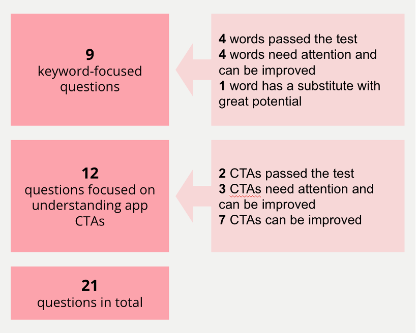
Cloze test summary
Cloze test summary


​ASKING MORE WHYs

Our final approach in this stage was to evaluate how effective our client’s app was when ordering food with non recruited users by doing a guerrilla usability testing. We made this decision based on the fact that we had a lot of quantitative and qualitative data, however, the survey and the interviews were not leading us to specific path of where the main issue was.

​We knew some people didn’t use the app because they never heard of it, some of them just prefer to stick with the main app in this market, and some of them had issues using the client’s app but were used to it.
But what made this app so underrated?


​USER JOURNEY MAPPING

After all the initial research, we worked to create a journey mapping for food delivery apps in general, and then started to understand how our client’s flow was fitting in that journey. We had identified several pain points, but we also made a very interesting discover!
Picture
User journey mapping on Miro

BREAKING POINT – WOW MOMENT

All the time the client would tell us their app was hard to use, but they couldn’t figure out why. We had a lot of data from qualitative and quantitative methods and the journey was the moment we started to understand why the client was not being able to find the main issue of their app. Digging into the data revealed some big insights into the food order experience using our client's app comparing to other apps.
​The usability and communication issues were spread throughout the app in a way that it was impossible to tell the client that a particular problem was what they needed to fix in order to avoid churn. It was, in fact, all the small problems throughout the journey that was making them lose users. 

The registration and the check-out process were fairly easy. However, the whole journey to get from one point to another added bits and pieces of frustration that led users to either give up on the app or restart the process all over away:
Mapping of the process within app

DIAGNOSIS

The project research consisted in the use of several methods. The conclusion we did identified 3 main aspects that make the client’s app unpleasant to use:
Diagnosis
Diagnosis

IDEATION TIME

After the presentation of the research results, a workshop was held to think of solutions for the users' pains. The team from different areas of the client’s app divided into groups and together they came up with 9 ideas. The dynamics resulted in 6 solution experiments. And two of them were prioritized to be tested and validate or invalidate.
  1. An onboarding
  2. A new feature (presented in other apps but not in our client’s)
Picture
Miro of our ideation workshop

THE TESTS AND RESULTS

We decided an unmoderated A/B test done remotely using a tool called Useberry would be the best approach, so we ran the test and were able to invalidate the hypothesis of an onboarding. On the other hand, the new feature hypothesis was validated.
 
This was important information, since the development of the onboarding would cost time and money for them and it would not have the expected outcome. However, the new feature could considerably increase the satisfaction with using the app since it would tackle a very important problem within the app and a part of the journey that users really value.
Picture
A/B test using Useberry

TAKEAWAY

This project was very challenging but exciting at the same time. A lot of methods were used, a lot of data was collect, and in the end the clients received a rich research material for them to work with.
 
Our client’s app was, after all, not a difficult app to use, however, there are several experience and service issues that make the user experience cluttered.
 
The tested solution concepts help to improve the user journey, but will not necessarily completely solve the research diagnosis. We believe that, by carrying out the modifications suggested throughout the project, as well as the guidelines after the concept tests, the experience of using the application will be more attractive to users, converting into more purchases.
Powered by Create your own unique website with customizable templates.
  • Portfolio
  • About
  • ARTICLES
  • Contact